Hot or Not - Which colour treatment works best?
Rizzo's Crash Course Adventure » Devlog
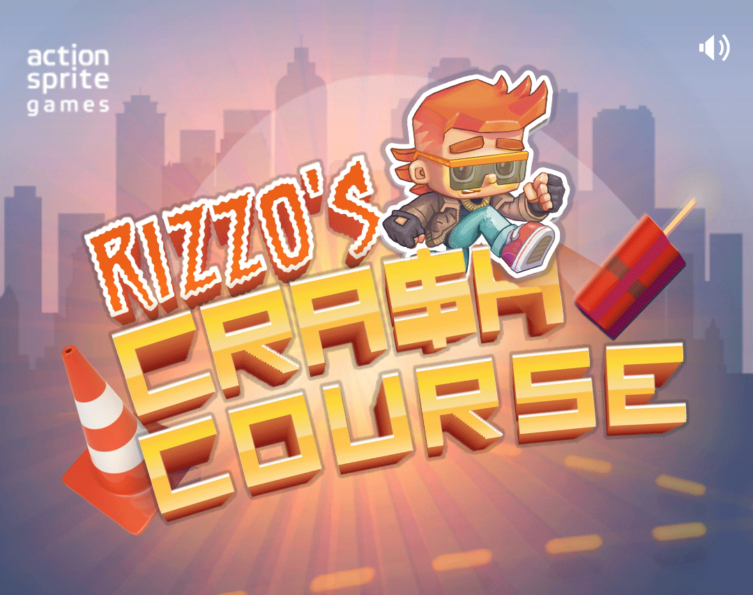
I'm working with the new character design for Rizzo and, as always, have gone down the rabbit hole of options.
I'm trying to work out a colour-scheme that will work well with the UI of the game, as well as read well at small and large sizes. What do you guys think? Which is the most appealing and easiest on the eye? And which hair colour works best?
 |  |
 |  |
 |  |
I know the difference will seem small but it's the sort of thing you get caught in a tailspin about, going round and round in circles! I need some extra eyes.
Please let me know which variation you prefer!
Get Rizzo's Crash Course Adventure
Rizzo's Crash Course Adventure
An inventive car-themed puzzle game where players collect loot, avoid obstacles, and unlock new vehicles.
| Status | In development |
| Author | actionsprite |
| Genre | Puzzle, Role Playing |
| Tags | car, Cute, Explosions, Isometric, Mouse only, Physics, Singleplayer, Top-Down |
| Languages | English |
| Accessibility | Interactive tutorial |
More posts
- Android Version Now Available - For Free!Jul 06, 2024
- New promo artJul 04, 2024
- The New Rizzo Revealed!Jul 01, 2024
- Timelapse video of our new character designMay 22, 2024
- WIP: A new take on our main character - RizzoMay 10, 2024
- What does it take to get a game up on the Google Play Store these days?May 03, 2024
- So which game engine is "Rizzo" built with?May 02, 2024
- Android version on the wayApr 19, 2024
- Game Dev Evolution: From day 1 to day 1,000Apr 18, 2024
Leave a comment
Log in with itch.io to leave a comment.